Case study:
Camp Digital
New website design for conference website
My role
- Wireframes
- Hi fidelity design
- HTML/CSS/JS
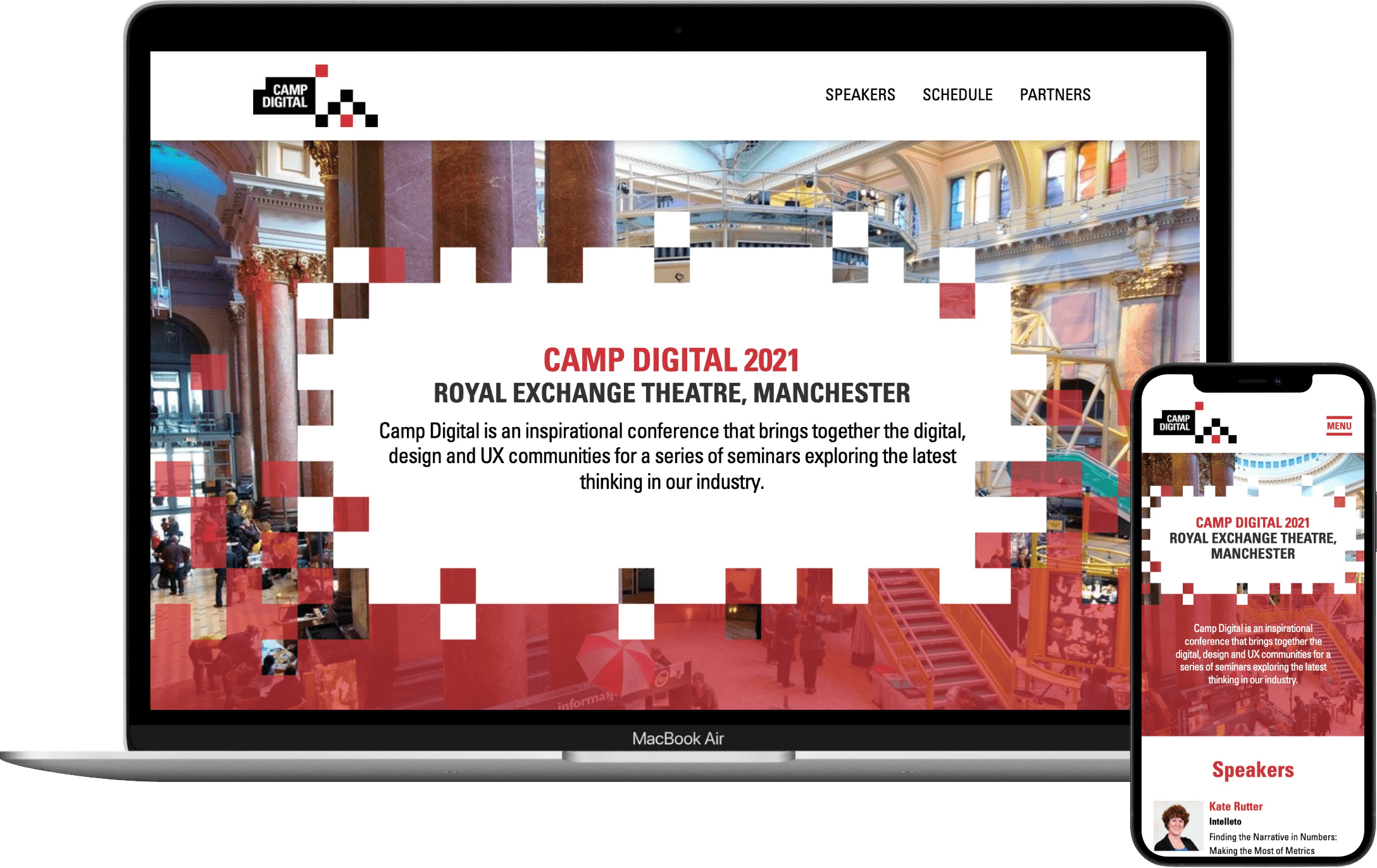
The website for a large northern UX conference, as it was hosted by a UX agency I needed to ensure high levels of usability and accessibility
I kept the site simple with as much information on one page as possible so as to be informational before the event, but also useful during it, when users have less time to be navigating around. essentially creating a mobile lanyard for the user.
The release of this version of the site was part of a successful strategy of boosting signup.