Case study:
Envirofone
Continuous design updates including a more performant checkout
My role
- Wireframes
- Design
- A/B testing
- HTML/CSS/JS

Envirofone is a mobile phone recycling service who offer money for your old devices. While working there it was a time of reduced marketing spend so wanted to lean on UX improvements to increase conversion.
As designer for Envirofone I was responsible for iterative design updates to its websites as part of an agile delivery team. Updates were data driven on the back of business requirements. Each update went thorough an A/B process to validate if it added value.
An analysis of the analytics for the sales funnel on the site showed that ther ewere improvments to be made in the checkout process.
The Checkout consisted of three screens: Basket, Payment and Confirmation. Looking into the anyalitics I discovered there is user drop off on every screen. The most concerning being the last one, as users had already made the effort to add personal details at this point and just needed to press a confirmation button.
 Envirofone original checkout
My hypothesis was that if we were to combine these steps into a relativley simple one-page checkout we would reduce the amount of drop-offs through the process. Of course there are risks in this, there is a reason GDS advises only one thing per page! But because it would go into an A/B test I was confident it was worth trying. I investigated various options to fit the content into one screen with minimal scrolling to keep CTAs above the fold where possible including using accordions and tabs, but decided that hiding content simply replicated the issues of the existing verison.
I used a card based layout and a good amount of content design to transform the journey into a 3 coloumn single page. Thes ecards allow flexibility of content while keeping a consistent layout.
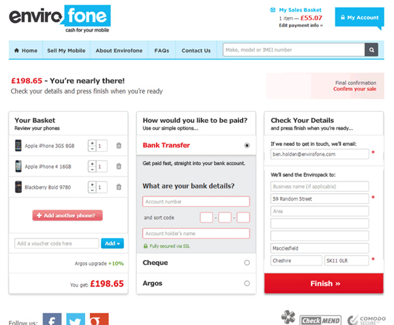 Checkout solution first iteration
On conclusion of the A/B test the new version showed to increase conversion by 30% of the original, so was seen as a huge success by the business. It wss rolled out to the BAU site where the upswing in conversion remained.
I refined the design for full release, including a progress indicator and cleaning up the UI even more.
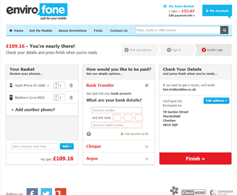 Checkout solution second iteration